CSS小组件类
换行前grid结构:
ChatGPT对话框
换行前grid结构:
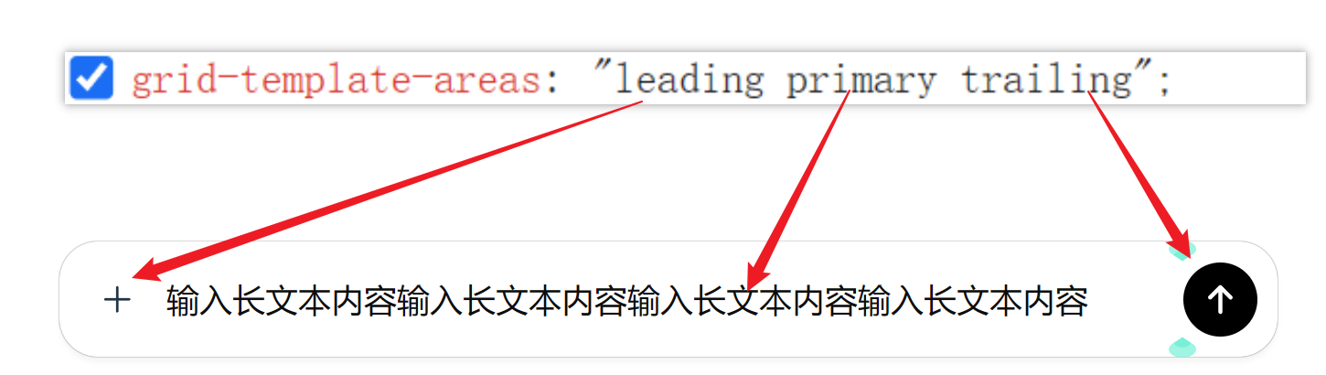
换行之后的gird结构:
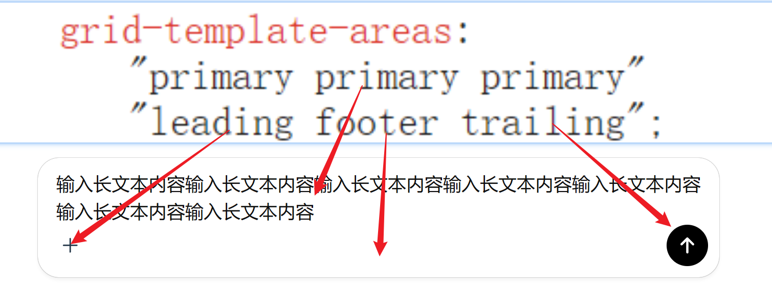
footer就是一个空的div用于占位,沾满宽度
对话框边框都是使用box-shadow
box-shadow: 0px 4px 4px 0px #0000000a, 0px 0px 1px 0px #0000009e;
比单纯的border更好看,内容输入时,使用的是contenteditable=true的div元素
按钮切换/胶囊按钮
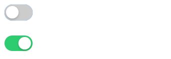
这个“胶囊开关”(Toggle Switch)之所以经典,是因为它完全不需要 JavaScript 就能实现交互动画。
它的核心原理是利用 HTML 的 <input type="checkbox"> 来记录状态,然后用 CSS 的 + 相邻兄弟选择器来控制后面 <span> 的样式。
<!DOCTYPE html>
<html>
<head>
<style>
  /* 1. 容器:决定开关的大小 */
  .toggle-switch {
    /* --- 可配置变量 --- */
    --width: 50px;           /* 宽度 */
    --height: 28px;          /* 高度 */
    --bg-off: #ccc;          /* 关闭时的颜色 */
    --bg-on: #007bff;        /* 开启时的颜色 (品牌蓝) */
    --ball-size: 22px;       /* 小圆球的大小 */
    --anim-speed: 0.3s;      /* 动画速度 */
    /* ---------------- */

    position: relative;
    display: inline-block;
    width: var(--width);
    height: var(--height);
  }

  /* 2. 隐藏原本丑陋的 checkbox */
  /* 我们不需要看它,但需要它的点击功能 */
  .toggle-switch input {
    opacity: 0;
    width: 0;
    height: 0;
  }

  /* 3. 滑道 (Slider):原本的背景条 */
  .slider {
    position: absolute;
    cursor: pointer;
    top: 0; left: 0; right: 0; bottom: 0;
    background-color: var(--bg-off);
    border-radius: var(--height); /* 胶囊形状 */
    transition: var(--anim-speed); /* 颜色过渡动画 */
  }

  /* 4. 小圆球 (Knob):利用伪元素画出来 */
  .slider::before {
    content: "";
    position: absolute;
    height: var(--ball-size);
    width: var(--ball-size);
    left: 3px;     /* 距离左边的间隙 */
    bottom: 3px;   /* 距离底部的间隙 */
    background-color: white;
    border-radius: 50%;
    transition: var(--anim-speed); /* 移动过渡动画 */

    /* 加上一点阴影让它更有立体感 */
    box-shadow: 0 2px 4px rgba(0,0,0,0.2);
  }

  /* =========================== */
  /* 交互状态 (核心魔法)      */
  /* =========================== */

  /* 当 input 被勾选时 -> 修改 slider 的背景色 */
  input:checked + .slider {
    background-color: var(--bg-on);
  }

  /* 当 input 被勾选时 -> 移动 slider 里的圆球 */
  /* 计算公式:总宽度 - 球宽 - 左右间隙 */
  input:checked + .slider::before {
    transform: translateX(calc(var(--width) - var(--ball-size) - 6px));
  }

  /* 额外:获得焦点时的无障碍优化 (Tab键选中时) */
  input:focus + .slider {
    box-shadow: 0 0 1px var(--bg-on);
  }
</style>
</head>
<body>

  <label class="toggle-switch">
    <input type="checkbox">
    <span class="slider"></span>
  </label>

  <div style="margin-top: 20px;">
    <label class="toggle-switch" style="--bg-on: #2ecc71;">
      <input type="checkbox" checked>
      <span class="slider"></span>
    </label>
  </div>

</body>
</html>
文字雨效果
<!DOCTYPE html>
<html lang="zh-CN">
<head>
  <meta charset="UTF-8">
  <meta name="viewport" content="width=device-width, initial-scale=1.0">
  <title>Matrix Rain Background Standalone</title>
  <style>
    /* 1. 设置全屏黑色背景,隐藏滚动条 */
    body {
      margin: 0;
      background-color: #000;
      overflow: hidden;
      height: 100vh;
    }

    /* 2. 容器:负责装载所有的雨滴列 */
    .matrix-container {
      position: fixed;
      top: 0;
      left: 0;
      width: 100%;
      height: 100%;
      display: flex;
      justify-content: space-between; /* 让列均匀分布 */
      /* 加上一个微妙的绿色滤镜,增强氛围感 */
      filter: sepia(100%) hue-rotate(90deg) saturate(300%);
      pointer-events: none; /* 确保背景不会挡住页面上的其他交互 */
      z-index: -1; /* 放在最底层 */
    }

    /* 3. 核心:每一列雨滴的样式 */
    .matrix-col {
      /* --- 核心魔法 --- */
      /* 让文字竖排 */
      writing-mode: vertical-rl;
      /* 让字母直立,而不是躺倒! */
      text-orientation: upright;
      /* ---------------- */

      font-family: 'Courier New', Courier, monospace; /* 必须等宽字体 */
      color: #fff; /* 用白色,然后通过容器的 filter 染成绿色,发光效果更好 */
      text-shadow: 0 0 8px rgba(255, 255, 255, 0.8); /* 发光效果 */

      white-space: nowrap;     /* 防止换行 */
      user-select: none;       /* 禁止用户选中 */
      will-change: transform;  /* 性能优化:告诉浏览器这个元素要动 */

      /* 应用下落动画 */
      animation: fall linear infinite;

      /* 遮罩:让头部和尾部有渐隐效果,看起来更像数据流 */
      mask-image: linear-gradient(to bottom, transparent, black 15%, black 85%, transparent);
      -webkit-mask-image: linear-gradient(to bottom, transparent, black 15%, black 85%, transparent);
    }

    /* 4. 定义下落动画关键帧 */
    @keyframes fall {
      from {
        /* 从屏幕上方看不见的地方开始 */
        transform: translateY(-100%);
      }
      to {
        /* 一直落到屏幕下方看不见的地方 */
        transform: translateY(100%);
      }
    }
  </style>
</head>
<body>

  <div class="matrix-container" id="matrixBg"></div>

  <div style="position: relative; z-index: 1; color: white; text-align: center; top: 40%;">
    <h1>The Matrix Has You.</h1>
  </div>


  <script>
    const container = document.getElementById('matrixBg');

    // 字符集:看起来比较像代码的字符
    // 你可以随意修改,比如加入片假名:'アイウエオカキクケコサシスセソタチツテトナニヌネノハヒフヘホマミムメモヤユヨラリルレロワヲン'
    const chars = 'ABCDEFGHIJKLMNOPQRSTUVWXYZ0123456789$+-*/=%"\'#&_(),.;:?!\\|{}<>[]^~';

    // 控制密度:数字越大,列数越少
    const density = 25;
    // 根据屏幕宽度计算需要多少列
    const numberOfColumns = Math.floor(window.innerWidth / density);

    // 循环创建每一列
    for (let i = 0; i < numberOfColumns; i++) {
      const col = document.createElement('div');
      col.classList.add('matrix-col');

      // 1. 生成随机字符串
      let text = "";
      // 随机长度,让每一列长短不一
      const stringLength = Math.floor(Math.random() * 25) + 15;
      for(let j = 0; j < stringLength; j++) {
        // 随机取字符
        text += chars.charAt(Math.floor(Math.random() * chars.length));
        // 偶尔加个空格,制造断断续续的感觉
        if (Math.random() > 0.9) text += " ";
      }
      col.innerText = text;

      // 2. 随机化动画参数,制造错落感

      // 动画时长:3秒到10秒之间
      const duration = Math.random() * 7 + 3;

      // 动画延迟:使用负数延迟,让动画一开始就处于进行中状态,不需要等待它们从头落下
      const delay = Math.random() * -10;

      // 随机字体大小,制造景深感(远近感)
      const fontSize = Math.random() * 10 + 12; // 12px 到 22px

      // 随机透明度,增加层次感
      const opacity = Math.random() * 0.6 + 0.4;

      // 应用样式
      col.style.animationDuration = `${duration}s`;
      col.style.animationDelay = `${delay}s`;
      col.style.fontSize = `${fontSize}px`;
      col.style.opacity = opacity;

      // 把这一列加到容器里
      container.appendChild(col);
    }
  </script>

</body>
</html>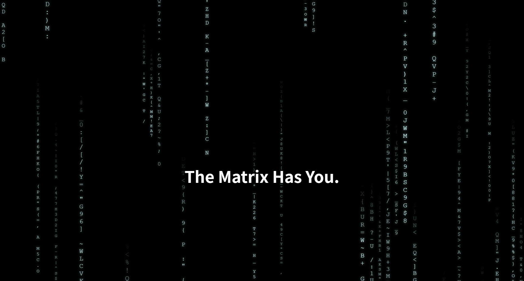
这个效果虽然看起来复杂,但底层核心就是你学的 CSS:
writing-mode: vertical-rl: 把文字流从“水平”改成“垂直”。text-orientation: upright: 这是点睛之笔。强制让垂直排列的字母“站直”,而不是默认的顺时针旋转 90 度躺下。- CSS Animation: 一个简单的
translateY动画,让这些垂直的文本条不停地向下移动。- JS 的作用: 它只是一个“生成器”。它计算屏幕需要多少列,然后生成一堆带有随机字符、随机速度、随机大小的
<div>,塞到页面里。真正的渲染和动画都是 CSS 在做,所以性能很好。
自定义复选框
图片复选框
<style>
  /* 隐藏原生 radio */
  input[type="checkbox"] {
     display: none;
  }

  /* 自定义 radio 容器 */
  .radio-container {
    display: inline-flex;
    align-items: center;
    cursor: pointer;
    user-select: none;
  }

  /* 自定义 radio 按钮的圆圈 */
  .radio-container::before {
    content: '';
    width: 16px;
    height: 16px;
    border: 1px solid #ccc;
    border-radius: 50%;
    background: white;
    box-sizing: border-box;
  }

  /* 选中后显示图片 */
  input[type="checkbox"]:checked + .radio-container::after {
    content: '';
    width: 16px;
    height: 16px;
    background-image: url('./编组.png');
    background-size: contain;
    background-repeat: no-repeat;
    position: absolute;
  }
</style>


<label>
  <input type="checkbox" name="option">
  <span class="radio-container">选项 1</span>
</label>

<label>
  <input type="checkbox" name="option">
  <span class="radio-container">选项 2</span>
</label>
彩色进度条
制作类似的进度条
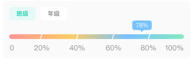
原始方案:使用5个不同的div拼接,shew设置平行四边形
新方案:使用背景渐变,组合渐变,一个条就完成
.progress-my {
  height: 8px;
  border-radius: 4px;
  opacity: 0.6;
  background:
    /* 插入固定的白色分隔线 */
    linear-gradient(120deg, transparent 0%, transparent 19.8%, white 19.8%, white 20.2%, transparent 20.2%),
    linear-gradient(120deg, transparent 0%, transparent 39.8%, white 39.8%, white 40.2%, transparent 40.2%),
    linear-gradient(120deg, transparent 0%, transparent 59.8%, white 59.8%, white 60.2%, transparent 60.2%),
    linear-gradient(120deg, transparent 0%, transparent 79.8%, white 79.8%, white 80.2%, transparent 80.2%),
    /* 原始渐变层 */
    linear-gradient(270deg, #37E19A 0%, #229BFF 32%, #FAB001 64%, #FF5151 100%);
}
🔍 原理
- 每条
linear-gradient(90deg, …)只负责一根白线(20%、40%、60%、80%)。 - 用
transparent → white → transparent来确保只有一条细白线出现。
自定义通知
float 最初的设计目的并不是做“定位”,而是为了实现图文环绕效果(就像杂志排版那样,文字环绕图片)。
当一个元素被 float 之后:
- 它会脱离正常文档流(normal flow),但不是完全脱离;
- 周围的行内内容(文字、行内元素)会围绕着它重新布局;
- 它仍然占据空间,只是普通块级元素会忽略它;
float与position都能改变位置,那一起使用呢?
当你在同一个元素上同时设置:
float: left;
position: absolute;
那么:
- 浏览器会忽略 float;
- 也就是说,
position的优先级更高; - 元素将完全按照
position的定位行为执行。
所以“同时使用”并不会叠加效果,而是由 position 决定。
float设置通知
让我们看看实际问题👇
| 问题点 | 描述 |
|---|---|
| ❌ 浮动依赖文档流 | float 仍然会影响父元素的高度,父容器会被“撑开” |
| ❌ 不脱离页面内容 | 页面上的文字、图片可能会“环绕”这些浮动通知 |
| ❌ 不固定在视口 | 页面滚动时,浮动通知会随内容一起滚动走 |
| ❌ 难以动画控制 | 浮动布局不是为动画或时间控制设计的 |
| ❌ 右上角定位不精确 | 无法用 top、right 来固定具体位置 |
用 position: fixed 设置通知区域
position: fixed 把整个通知区域固定在右上角;
flex-direction: column 让多个通知自动从上往下堆;
每个 .toast 元素进入时滑入 (transform),消失时淡出;
不需要 float,因为 float 会影响文档流,不适合悬浮元素;
也不建议用 absolute,除非通知容器在一个特定容器内部。
具体实现(自研)
源码:
toast/index.js
import { createApp, h } from 'vue'
import MyToast from './MyToast.vue'
let container = null
function showToast(options) {
  // 创建消息容器(定义样式位置)
  if (!container) {
    container = document.createElement('div')
    document.body.appendChild(container)
    Object.assign(container.style, {
      position: 'fixed',
      top: '0',
      left: '50%',
      width: '100%',
      transform: 'translateX(-50%)',
      zIndex: 9999,
      display: 'flex',
      flexDirection: 'column',
      alignItems: 'center',
      pointerEvents: 'none'
    })
  }
  //创建消息容器
  const children = document.createElement('div')
  Object.assign(children.style, {
    margin: '10px 0',
    display: 'inline-block',
  })
  container.appendChild(children) // 新的在上方

  const { content, msg, during = 2000 } = options
  const slots = {}
  if (content) slots.default = () => (typeof content === 'function' ? content() : content)

  const app = createApp({
    render() {
      return h(MyToast, {
        msg,
      }, slots)
    }
  })
  app.mount(children)
  setTimeout(() => {
    // 统计旧元素的位置(不包括删除元素)[First]
    const oldRects = Array.from(container.children).filter(el => el !== children).map(el => el.getBoundingClientRect())
    // 创建幽灵元素在原来的位置
    // 移除元素(变为绝对定位,所以位置不影响其他元素,空出位置)
    children.style.top = `${children.getBoundingClientRect().top}px`//改变position前就获取原位置
    children.style.position = 'absolute'
    children.style.transition = `all 0.5s`
    // children.style.transformOrigin = 'left top' //缩小动画的基点
    requestAnimationFrame(() => {
      children.style.opacity = '0'//淡出
      children.style.transform = 'scale(0.2)' //缩小
    })
    setTimeout(() => {
      container.removeChild(children)
    }, 500);
    // 获取其他元素新位置 [Last]
    const newRects = Array.from(container.children).filter(el => el !== children).map(el => el.getBoundingClientRect())

    // 播放动画 [Invert] -> [Play]
    animateFLIP(Array.from(container.children).filter(el => el !== children), oldRects, newRects)
  }, during)
}
function animateFLIP(survivors, oldRects, newRects) {
  // 计算位置变化并应用动画
  survivors.forEach((el, i) => {
    const oldRect = oldRects[i]
    const newRect = newRects[i]
    if (!oldRect || !newRect) return
    const dy = oldRect.top - newRect.top
    // 初始位置:反向位移(Invert)
    el.style.transition = 'none'
    el.style.transform = `translateY(${dy}px)`
  })
  // 触发重绘后播放动画(Play)
  requestAnimationFrame(() => {
    survivors.forEach((el, i) => {
      el.style.transition = 'transform 0.5s ease'
      el.style.transform = ''
    })
  })
}
export default showToast
toast/MyToast.vue
<template>
  <div ref="children">
    <slot>
      <div class="default">
        {{ msg }}
      </div>
    </slot>
  </div>
</template>

<script setup>
const props = defineProps({
  msg: {
    type: String,
    default: '默认内容'
  }
})
</script>使用方式app.vue:
<template>
  <button @click="handleToast(10)" class="hover:bg-red-400">通知10s</button>
  <button @click="handleToast(5)" class="hover:bg-red-400">通知5s</button>
</template>

<script setup>
import showToast from './toast'
import { h } from 'vue'
let n = 0
function handleToast(num) {
  showToast({
    during: num * 1000,
    content: h('div', { style: "background-color:red;" }, `通知内容` + n++)
  })
}
</script>
抛物线
原理就是,两个盒子嵌套关系,通过计算时间,两个盒子往两个方向做变换,最终展现出抛物线的效果
涉及原理:元素坐标变换,过渡
吸顶检查
<template>
  <div class="container">
    <div class="backgroundTop"></div>

    <!-- sentinel 放在 nav-bar 前 -->
    <div ref="sentinel" class="sentinel"></div>

    <div ref="navBar" class="nav-bar">
      <div class="title">学单词</div>
    </div>

    <!-- 用来制造滚动 -->
    <div style="height: 2000px"></div>
  </div>
</template>

<script setup>
import { ref, onMounted, onBeforeUnmount } from 'vue'

const sentinel = ref(null)
const navBar = ref(null)
let observer = null

onMounted(() => {
  observer = new IntersectionObserver(([entry]) => {
    if (entry.isIntersecting) {
      navBar.value.classList.remove('scrolled')
    } else {
      navBar.value.classList.add('scrolled')
    }
  })
  observer.observe(sentinel.value)
})

onBeforeUnmount(() => {
  if (observer) observer.disconnect()
})
</script>
<style>
*{
    margin: 0;
}
</style>
<style scoped>
.container {
  position: relative;
  min-height: 100vh;
}

.backgroundTop {
  position: absolute;
  top: 0;
  bottom: 0;
  width: 100%;
  z-index: -1;
  background-image:
    radial-gradient(circle at left top, #d0eef9 0, #eef0fa 250px, transparent 300px),
    radial-gradient(circle at right top, #e0e6ff 0, #f4f5f7 300px, transparent 200px);
  background-color: #f4f5f7;
}

.nav-bar {
  position: sticky;
  top: 0;
  display: flex;
  align-items: center;
  height: 44px;
  padding: 0 12px;
  background-color: transparent;
  z-index: 10;
  transition: background-color 0.25s, box-shadow 0.25s;
}

.nav-bar.scrolled {
  background-color: white;
  box-shadow: 0 2px 8px rgba(0, 0, 0, 0.05);
}

.title {
  flex: 1;
  text-align: center;
  font-size: 16px;
  font-weight: bold;
}

.sentinel {
  height: 0px;
}
</style>
打字机效果
效果展示:
原理分解
光标实现原理
- 不是真的鼠标光标,而是CSS制作的视觉元素
- 使用
@keyframes blink动画让光标闪烁 - 通过控制
opacity在0和1之间切换实现闪烁效果
.blink {
  width: 3px;
  background-color: black;
  margin-left: 10px;
  animation: blink 1s infinite;
}
@keyframes blink {
  0%,100% {
    opacity: 1;
  }
  50% {
    opacity: 0;
  }
}
字体逐个出现原理
- 字符串分解:将完整文本按字符索引访问
- 递归定时器:使用
setTimeout递归调用 - DOM更新:每次在元素中添加一个新字符
- 速度控制:通过调整setTimeout间隔控制打字速度
字体逐个消失原理
- 反向操作:从字符串末尾开始删除
- 字符串截取:使用
substring(0, index)截取前面部分 - 索引递减:每次删除后索引减1
- 保持光标:删除过程中始终显示光标
实现代码逻辑
<template>
  <div class="main p-[30px] text-center">
    <div class="flex justify-center items-stretch">
      <h1 class="text text-4xl ">{{ '“'+text }}</h1>
      <div class="blink"></div>
    </div>
  </div>
</template>
<script setup>
import { ref,onMounted } from 'vue'
const textArr = ["床前明月光", "疑是地上霜", "举头望明月", "低头思故乡"]
const text = ref('')

onMounted(() => {
  // 定时器,但是字体是一个一个出现,出现玩一句之后,慢慢一个字一个字删除,然后再出现下一行
  let lineIndex = 0 // 当前行索引
  let charIndex = 0 // 当前字符索引
  let isDeleting = false // 是否在删除字符
  const typeSpeed = 200 // 打字速度
  const deleteSpeed = 200 // 删除速度
  const pauseTime = 1000 // 每行文字显示后的停顿时间
  function type() {
    const currentText = textArr[lineIndex]
    if (!isDeleting) {
      // 打字
      text.value = currentText.substring(0, charIndex + 1)
      charIndex++
      if (charIndex === currentText.length) {
        // 当前行打完,开始删除
        isDeleting = true
        setTimeout(type, pauseTime) // 停顿一会儿再删除
        return
      }
      setTimeout(type, typeSpeed)
    } else {
      // 删除
      text.value = currentText.substring(0, charIndex - 1)
      charIndex--
      if (charIndex === 0) {
        // 当前行删除完,切换到下一行
        isDeleting = false
        // 继续下一行。循环
        lineIndex = (lineIndex + 1) % textArr.length
        // 停顿一会儿再添加
        setTimeout(type, pauseTime)
      }else {
        // 继续删除
        setTimeout(type, deleteSpeed)
      }
    }
  }
  type()
})
</script>
<style scoped>
.blink {
  width: 3px;
  background-color: black;
  margin-left: 10px;
  animation: blink 1s infinite;
}
@keyframes blink {
  0%,100% {
    opacity: 1;
  }
  50% {
    opacity: 0;
  }
}
</style>
items-stretch会拉伸后面那个元素到父元素相同高度!后面那个元素设置
h-full失效,因为父元素没有明确的高度!加上默认字
“是文字框始终有高度,所以闪烁的元素始终存在
下划线动画
单行
下划线是个单独的元素,通过动画控制max-width
.scroll-menu li .my-menu[data-v-3faf1cc4]:after {
    transition: max-width .25s ease-in-out;
}
多行
使用背景作为下划线方案
设置下划线的宽度从0到100%,这样就会慢慢出现了。
<template>
  <div class="main p-[30px] text-center">
    <span>在这个充满创意的数字时代,我们相信设计的力量能够改变世界。每一个细节都值得用心打磨,每一次交互都应该令人愉悦</span>
  </div>
</template>
<style setup>
span{
  background-image:linear-gradient(90deg, #ff8a00, #e52e71);
  background-size: 0 2px;
  background-repeat: no-repeat;
  background-position: left bottom;
  transition:all .5s;
}
span:hover{
  background-size: 100% 2px;
}
</style>
如果想相反的方向消失,就设置位置改变:
span{
  background-image:linear-gradient(90deg, #ff8a00, #e52e71);
  background-size: 0 2px;
  background-repeat: no-repeat;
  transition: background-size 2s;
  background-position: right bottom;
}
span:hover{
  background-position: left bottom;
  background-size: 100% 2px;
}
FPS监测
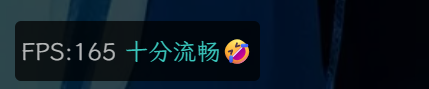
原理:用 requestAnimationFrame 得到每一帧的时间戳(performance.now() 的 t),计算两帧间隔 dt(ms),每秒 FPS ≈ 1000 / dt(瞬时)或用 N 帧累计平均得到更稳定的 FPS。
<script setup>
import { ref, onMounted, onUnmounted } from "vue"

const fps = ref(0)
let last = performance.now()
let frame = 0
let rafId = null

function loop(now) {
  frame++
  const delta = now - last
  if (delta >= 1000) { // 每 1 秒更新一次
    fps.value = Math.round((frame * 1000) / delta)
    frame = 0
    last = now
  }
  rafId = requestAnimationFrame(loop)
}

onMounted(() => {
  rafId = requestAnimationFrame(loop)
})

onUnmounted(() => {
  cancelAnimationFrame(rafId)
})
</script>

<template>
  <div>
    当前 FPS:{{ fps }}
  </div>
</template>
工作原理:
- 使用
requestAnimationFrame来计数。- 每次回调时记录帧数
frame。- 当累计时间 ≥ 1000ms,就计算
fps = frame / delta * 1000,更新到界面。
边缘羽化 CSS Mask 实现
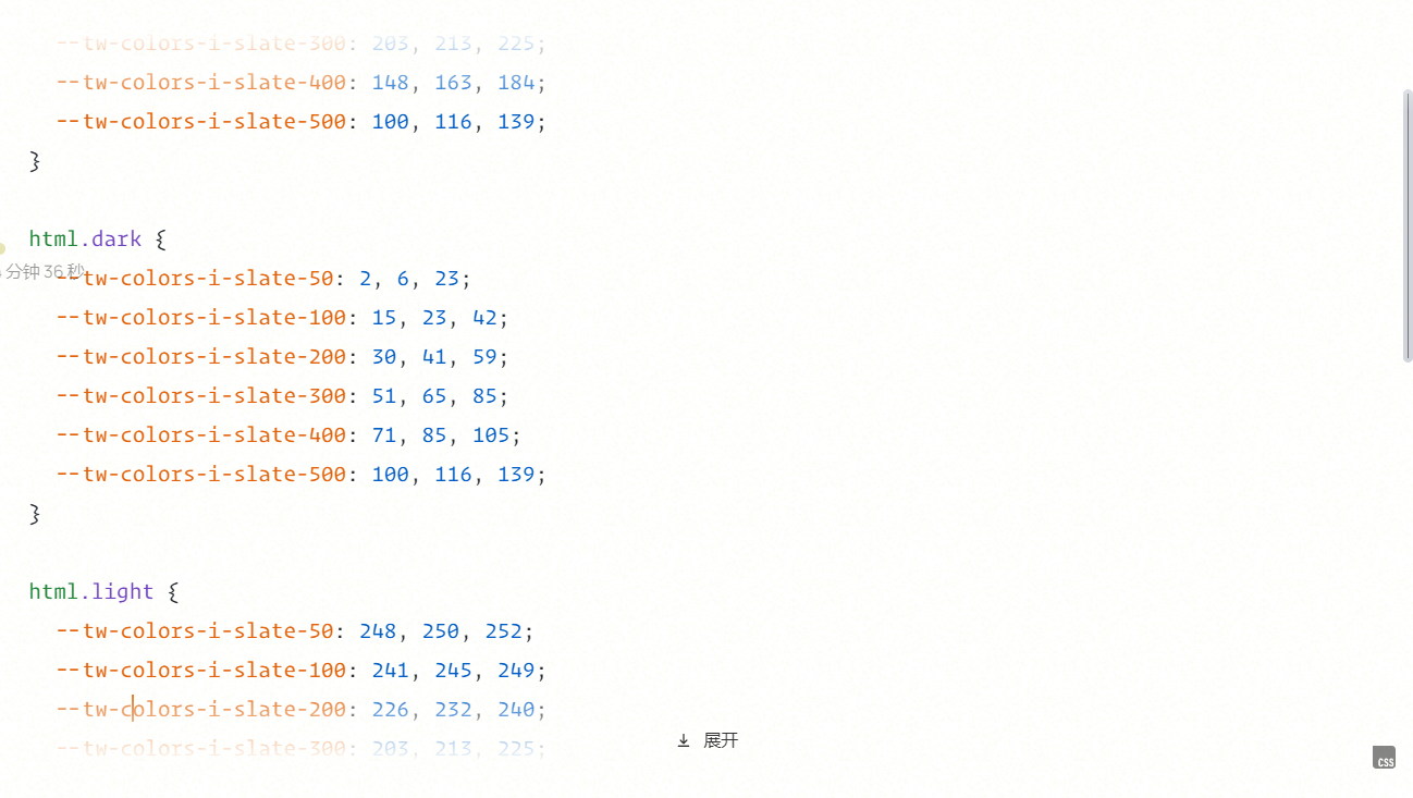
在很多时候都需要处理文字的溢出,尤其是对单行网格处理时,需要避免文字过长导致容器撑坏的情况。一般会固定文字最大宽度和 overflow: hidden; text-overflow: ellipsis 让溢出的文字显示成 ...。但是现在可以用 CSS 的 mark 属性,让溢出的文字边缘羽化。
如图 Chrome 的 tab。

mask-image 和 background-image 的值一样,和蒙版一样,黑色的显示,透明的不显示。我们可以很简单的用 linear-gradient 完成边缘羽化效果。
mask-image: linear-gradient(
  to right,
  rgba(0, 0, 0, 1) calc(100% - 2em),
  transparent
);

//
-webkit-mask-image: linear-gradient(
  to bottom,
  transparent 0,
  rgba(0, 0, 0, 1) 1.3em,
  rgba(0, 0, 0, 1) calc(100% - 1.3em),
  transparent 100%
);
mask-image: linear-gradient(
  to bottom,
  transparent 0,
  rgba(0, 0, 0, 1) 1.3em,
  rgba(0, 0, 0, 1) calc(100% - 1.3em),
  transparent 100%
);
-webkit-mask-size: 100% 100%;
mask-size: 100% 100%;
-webkit-mask-repeat: no-repeat;
mask-repeat: no-repeat;
当然啦,如果遇到不支持的浏览器就显示直接截断的效果,很不好看,我们还想要让他显示 ...,那么可以用 @supports 查询,是否支持这个属性,如果支持才使用,不支持就使用 text-overflow: ellipsis;。
.tab-wrap .tab {
  width: 100%;
  overflow: hidden;
  text-overflow: ellipsis;
}
@supports (-webkit-mask-image: inherit) or (mask-image: inherit) {
  .tab-wrap .tab {
    text-overflow: clip;
    -webkit-mask-image: linear-gradient(
      to right,
      rgba(0, 0, 0, 1) calc(100% - 2em),
      transparent
    );
    mask-image: linear-gradient(
      to right,
      rgba(0, 0, 0, 1) calc(100% - 2em),
      transparent
    );
  }
}
比background-image好处就是不用关心背景色是什么颜色
自定义分页组件
MyPagination.vue
<template>
  <div class="pagination">
    <!-- 总数 -->
    <span class="total">共 {{ total }} 条</span>

    <!-- 每页条数选择 -->
    <select
      v-model.number="localPageSize"
      @change="handleSizeChange"
      class="page-size"
    >
      <option v-for="size in pageSizes" :key="size" :value="size">
        每页 {{ size }} 条
      </option>
    </select>

    <!-- 页码切换 -->
    <button class="btn" :disabled="localCurrentPage === 1" @click="goPrev">
      上一页
    </button>

    <span class="pages">
      <button
        v-for="item in pageList"
        :key="item.key"
        :disabled="item.ellipsis"
        :class="['page-btn', { active: item.num === localCurrentPage, ellipsis: item.ellipsis }]"
        @click="!item.ellipsis && changePage(item.num)"
      >
        {{ item.text }}
      </button>
    </span>

    <button
      class="btn"
      :disabled="localCurrentPage === pageCount"
      @click="goNext"
    >
      下一页
    </button>
  </div>
</template>

<script setup>
import { ref, computed } from 'vue'

const props = defineProps({
  total: { type: Number, required: true },
  pageSizes: { type: Array, required: true },
  pageSize: { type: Number, required: true },
  currentPage: { type: Number, required: true },
  maxButtons: { type: Number, default: 7 } // ⭐ 新增
})

const emit = defineEmits(['size-change', 'current-change'])

// 本地状态
const localPageSize = ref(props.pageSize)
const localCurrentPage = ref(props.currentPage)

// 页数计算
const pageCount = computed(() => Math.ceil(props.total / localPageSize.value))

// 切换每页条数
function handleSizeChange() {
  emit('size-change', localPageSize.value)
  if (localCurrentPage.value > pageCount.value) {
    localCurrentPage.value = 1
    emit('current-change', 1)
  }
}

// 切换页码
function changePage(page) {
  if (page === localCurrentPage.value) return
  localCurrentPage.value = page
  emit('current-change', page)
}

function goPrev() {
  if (localCurrentPage.value > 1) changePage(localCurrentPage.value - 1)
}

function goNext() {
  if (localCurrentPage.value < pageCount.value) changePage(localCurrentPage.value + 1)
}

// ⭐ 页码省略号逻辑
const pageList = computed(() => {
  const total = pageCount.value                 // 总页数
  const current = localCurrentPage.value        // 当前页
  const max = Math.max(5, props.maxButtons)     // 最大按钮数(至少为5,太少没意义)
  const half = Math.floor(max / 2)              // 一半的按钮数,用来让当前页尽量居中
  const list = []                               // 最终生成的页码数组

  // 情况①:总页数少于最大按钮数 → 全部显示,无需省略号
  if (total <= max) {
    for (let i = 1; i <= total; i++) {
      list.push({ num: i, text: i, key: i })
    }
  }
  // 情况②:总页数多,需要加省略号
  else {
    /**
     * start / end 表示中间连续页码的起止范围(不包括第一页与最后一页)
     * 例如:
     * total = 50, current = 18, max = 9
     * 则中间显示的范围大约为 14~22
     */
    let start = Math.max(2, current - half + 2)
    let end = Math.min(total - 1, current + half - 2)

    /**
     * 边界修正:
     * 当前页靠近开头或结尾时,不能居中显示,否则页码会超出范围。
     * 因此我们在两端时强制对齐。
     */
    if (current <= half) {
      // 当前页靠前,比如 current = 2~4
      // 从第2页开始显示,最多显示 (max - 2) 个页码
      start = 2
      end = max - 2
    } else if (current >= total - half + 1) {
      // 当前页靠后,比如 current = 48~50
      // 从倒数第(max - 3)页开始显示到 total-1
      start = total - max + 3
      end = total - 1
    }

    /**
     * 拼接页码:
     * 结构形如:
     * [1] ... [start ~ end] ... [total]
     */
    list.push({ num: 1, text: 1, key: 'first' }) // 首页

    // 左侧省略号(如果中间段不是紧挨第一页)
    if (start > 2) {
      list.push({ text: '...', ellipsis: true, key: 'left-ellipsis' })
    }

    // 中间连续页码
    for (let i = start; i <= end; i++) {
      list.push({ num: i, text: i, key: i })
    }

    // 右侧省略号(如果中间段不是紧挨最后一页)
    if (end < total - 1) {
      list.push({ text: '...', ellipsis: true, key: 'right-ellipsis' })
    }

    // 尾页
    list.push({ num: total, text: total, key: 'last' })
  }

  return list
})

</script>

<style lang="scss" scoped>
.pagination {
  display: flex;
  align-items: center;
  gap: 8px;
  font-size: 14px;

  .total {
    color: #666;
  }

  .page-size {
    padding: 4px 6px;
  }

  .btn {
    padding: 4px 8px;
    border: 1px solid #ccc;
    background: #fff;
    cursor: pointer;
    border-radius: 4px;
    &:disabled {
      opacity: 0.5;
      cursor: not-allowed;
    }
  }

  .pages {
    display: flex;
    gap: 4px;

    .page-btn {
      padding: 4px 8px;
      border: 1px solid #ccc;
      border-radius: 4px;
      background: #fff;
      min-width: 50px;
      cursor: pointer;
      &.active {
        background: #409eff;
        color: white;
        border-color: #409eff;
      }
      &.ellipsis {
        cursor: default;
        color: #999;
      }
    }
  }
}
</style>
Test.vue
<template>
  <div>
    <MyPagination
      :total="total"
      :page-sizes="pageSizes"
      :page-size="pageSize"
      :current-page="currentPage"
      :max-buttons="9"
      @size-change="handleSizeChange"
      @current-change="handleCurrentChange"
    />

    <div style="margin-top: 20px;">
      <p>当前页:{{ currentPage }}</p>
      <p>每页条数:{{ pageSize }}</p>
      <p>总条数:{{ total }}</p>

      <!-- 动态修改按钮 -->
      <button @click="total += 20">增加总数</button>
      <button @click="total = 100">重置总数</button>
      <button @click="pageSize = 4">切换为每页 5 条</button>
      <button @click="currentPage = 1">回到第一页</button>
      <button @click="pageSizes.push(4)">改变列表</button>
    </div>
  </div>
</template>

<script setup>
import { ref } from 'vue'
import MyPagination from './MyPagination.vue'

// ✅ 响应式状态
const total = ref(120)
const pageSizes = ref([5, 10, 20])
const pageSize = ref(10)
const currentPage = ref(1)

// ✅ 事件回调(与 MyPagination.vue 的 emit 对应)
function handleSizeChange(size) {
  pageSize.value = size
  console.log('每页条数变为', size)
}

function handleCurrentChange(page) {
  currentPage.value = page
  console.log('当前页变为', page)
}
</script>

<style scoped>
button {
  margin-right: 8px;
  padding: 4px 8px;
}
</style>
使用原生实现:
---
import { getCollection } from "astro:content";
const docs = await getCollection("docs");
import "../styles/global.css";
---

<meta charset="UTF-8" />
<title>Markdown List</title>

<div class="flex h-[40vh] flex-col">
    <div class="flex-1 overflow-y-auto">
        <!-- 列表容器 -->
        <ul id="list"></ul>
    </div>
    <!-- 分页容器:所有分页按钮 + 每页选择器 都放这里 -->
    <div class="pagination" id="pagination"></div>
</div>

<style is:global>
    .bottom{
        height: calc(20%-40px);
    }
    body{
        margin: 0;
    }
    ul {
        list-style: none;
        padding: 0;
        margin: 0;
    }
    li {
        margin-bottom: 6px;
    }

    .pagination {
        display: flex;
        gap: 8px;
        align-items: center;
        flex-wrap: wrap;
    }

    .pagination button {
        padding: 4px 10px;
        border: 1px solid #ccc;
        background: white;
        cursor: pointer;
        border-radius: 4px;
    }

    .pagination button.active {
        background: #007bff;
        color: white;
        border-color: #007bff;
    }

    .pagination button:disabled {
        opacity: 0.5;
        cursor: not-allowed;
    }

    /* 放在分页容器内的每页选择器样式 */
    .page-size {
        display: flex;
        gap: 8px;
        align-items: center;
    }
    .page-size select {
        padding: 3px 16px;
        border-radius: 4px;
        border: 1px solid #ccc;
        appearance: none; /* 去掉系统默认箭头 */
        -webkit-appearance: none;
        -moz-appearance: none;
    }
</style>

<script define:vars={{ _docs: docs }}>
    const docs = _docs;

    // 状态
    let currentPage = 1;
    let pageSize = 10; // 默认每页 10 条
    const pageSizeOptions = [2, 10, 20, 30];
    const maxButtons = 7; // 最大按钮数(含首尾与省略号逻辑)

    // DOM
    const listEl = document.getElementById("list");
    const paginationEl = document.getElementById("pagination");

    // 计算页码数组(带省略号)
    function getPageList(total, current, max) {
        const list = [];
        const half = Math.floor(max / 2);
        if (total <= max) {
            for (let i = 1; i <= total; i++) list.push(i);
        } else {
            let start = Math.max(2, current - half + 2);
            let end = Math.min(total - 1, current + half - 2);

            if (current <= half) {
                start = 2;
                end = max - 2;
            } else if (current >= total - half + 1) {
                start = total - max + 3;
                end = total - 1;
            }

            list.push(1);
            if (start > 2) list.push("...");
            for (let i = start; i <= end; i++) list.push(i);
            if (end < total - 1) list.push("...");
            list.push(total);
        }
        return list;
    }

    // 渲染列表当前页的数据
    function renderList() {
        listEl.innerHTML = "";
        const start = (currentPage - 1) * pageSize;
        const end = start + pageSize;
        const items = docs.slice(start, end);
        for (const post of items) {
            const li = document.createElement("li");
            li.innerHTML = `<a href="/docs/${post.slug}">${post.data.title} - ${post.data.pubDate}</a>`;
            listEl.appendChild(li);
        }
    }

    // 在 paginationEl 内渲染:上一页、页码(含省略号)、下一页、以及 pageSize select(全部在同一容器)
    function renderPagination() {
        paginationEl.innerHTML = "";
        // 每页选择器
        // ---- 把 pageSize 选择器也放在同一容器内 ----
        const sizeWrapper = document.createElement("div");
        sizeWrapper.className = "page-size";

        const label = document.createElement("span");
        label.textContent = "每页显示";
        sizeWrapper.appendChild(label);

        const select = document.createElement("select");
        select.name = "pageSize";
        // 生成选项并选择当前 pageSize
        for (const opt of pageSizeOptions) {
            const o = document.createElement("option");
            o.value = String(opt);
            o.textContent = String(opt);
            if (opt === pageSize) o.selected = true;
            select.appendChild(o);
        }

        // 切换 pageSize:重置到第一页并重新渲染(分页 + 列表)
        select.onchange = (e) => {
            const v = parseInt(e.target.value, 10);
            if (!Number.isNaN(v) && v > 0) {
                pageSize = v;
                currentPage = 1;
                render();
            }
        };

        sizeWrapper.appendChild(select);
        sizeWrapper.appendChild(document.createTextNode("条"));

        // 将选择器添加到 pagination 容器(同一 div 内)
        paginationEl.appendChild(sizeWrapper);
        const totalPages = Math.max(1, Math.ceil(docs.length / pageSize));
        // 保证 currentPage 在合法范围
        if (currentPage > totalPages) currentPage = totalPages;
        if (currentPage < 1) currentPage = 1;

        const pages = getPageList(totalPages, currentPage, maxButtons);

        // 上一页
        const prev = document.createElement("button");
        prev.textContent = "上一页";
        prev.disabled = currentPage === 1;
        prev.onclick = () => {
            if (currentPage > 1) {
                currentPage--;
                render();
            }
        };
        paginationEl.appendChild(prev);

        // 页码按钮(含省略号)
        for (const p of pages) {
            const btn = document.createElement("button");
            btn.textContent = p;
            if (p === "...") {
                btn.disabled = true;
                btn.classList.add("ellipsis");
            } else {
                if (p === currentPage) btn.classList.add("active");
                btn.onclick = () => {
                    currentPage = p;
                    render();
                };
            }
            paginationEl.appendChild(btn);
        }

        // 下一页
        const next = document.createElement("button");
        next.textContent = "下一页";
        next.disabled = currentPage >= totalPages;
        next.onclick = () => {
            if (currentPage < totalPages) {
                currentPage++;
                render();
            }
        };
        paginationEl.appendChild(next);
    }

    function render() {
        renderList();
        renderPagination();
    }

    // 首次渲染
    render();
</script>
动效
为什么会有这个离谱的东西:
一共29个图片状态

<div class="heart"></div>
<style>
.heart {
  width: 100px;
  height: 100px;
  position: absolute;
  left: 50%;
  top: 50%;
  transform: translate(-50%, -50%);
  background: url(https://cssanimation.rocks/images/posts/steps/heart.png) no-repeat;
  background-position: 0 0;
  cursor: pointer;
}
.heart.active {
  background-position: -2800px 0;
  transition: background 1s steps(28);
}
</style>
<script>
    const heart = document.querySelector('.heart');
    heart.addEventListener('click', () => {
        heart.classList.toggle('active');
    });
</script>steps()就是分几步来完成我们的动画,去除第一个默认状态,正好就是二十八步!

书本翻页效果
代码
<template>
  <div class=" relative my-10 h-[600px] perspective-[2400px] overflow-hidden transform-3d p-10">
    <div v-for="value in 10" @click="handleClick" class="base" :style="{ '--z-index-container': 9999 - value }" data-status="0">
      <div class="page-base" :style="{ '--z-index': 9999 - value * 2 }">
        <div>
          <h1>这是第{{ value }}页!</h1>
        </div>
      </div>
      <div class="page-base" :style="{ '--z-index': value * 2 - 1 }">
        <div class="reverse">
          <h1>这是第{{ value }}页背面!</h1>
        </div>
      </div>
    </div>
  </div>
</template>
<script setup>
let flags = [false, false]
function handleClick(e) {
  const isLeft = e.currentTarget.children[0].contains(e.target);
  console.log(isLeft);
  console.log( e.target);

  const flagIndex = isLeft ? 0 : 1;
  const otherIndex = !isLeft ? 0 : 1;
  if (flags[flagIndex]) return;
  flags[otherIndex] = true;
  setTimeout(() => (flags[otherIndex] = false), 1000);
  (isLeft ? turnLeft : turnRight)();
}
function turnLeft(){
  const containerArr = Array.from(document.querySelectorAll('.base'))
  //左页元素索引 -1~... 所以右侧的就是index+1
  let leftIndex = containerArr.map(el=>el.dataset.status).lastIndexOf('1');
  console.log(leftIndex);
  if(containerArr[leftIndex+1]){
    containerArr[leftIndex+1].dataset.status = '1';
    animateLeft(containerArr[leftIndex+1])
  }
}
function turnRight(){
  const containerArr = Array.from(document.querySelectorAll('.base'))
  //左页元素索引 -1~... 所以右侧的就是index+1
  let leftIndex = containerArr.map(el=>el.dataset.status).lastIndexOf('1');
  console.log(leftIndex);
  if(containerArr[leftIndex]){
    containerArr[leftIndex].dataset.status = '0';
    animateRight(containerArr[leftIndex])
  }
}
function animateLeft(el){
  el.animate([
      {
        transform: 'rotateY(0deg)',
        zIndex: 'var(--z-index-container)',
        offset: 0
      }, {
        transform: 'rotateY(-90deg)',
        zIndex: 'var(--z-index-container)',
        offset: 0.5
      }, {
        transform: 'rotateY(-90deg)',
        zIndex: 0,
        offset: 0.51
      }, {
        transform: 'rotateY(-180deg)',
        zIndex: 0,
        offset: 1
      }
    ], {
      duration: 1000,
      fill: 'forwards'
    });
  Array.from(el.children).forEach(children => {
    children.animate([
        {
          zIndex: 'var(--z-index)',
          offset: 0
        }, {
          zIndex: 'var(--z-index)',
          offset: 0.5
        }, {
          zIndex: 0,
          offset: 0.51
        }, {
          zIndex: 0,
          offset: 1
        }
      ], {
        duration: 1000,
        fill: 'forwards'
      })
  })
}
function animateRight(el){
  el.animate([
      {
        transform: 'rotateY(-180deg)',
        zIndex: 0,
        offset: 0
      }, {
        transform: 'rotateY(-90deg)',
        zIndex: 0,
        offset: 0.5
      }, {
        transform: 'rotateY(-90deg)',
        zIndex: 'var(--z-index-container)',
        offset: 0.51
      }, {
        transform: 'rotateY(0deg)',
        zIndex: 'var(--z-index-container)',
        offset: 1
      }
    ], {
      duration: 1000,
      fill: 'forwards'
    });
    Array.from(el.children).forEach(children => {
      children.animate([
        {
          zIndex: 0,
          offset: 0
        }, {
          zIndex: 0,
          offset: 0.5
        }, {
          zIndex: 'var(--z-index)',
          offset: 0.51
        }, {
          zIndex: 'var(--z-index)',
          offset: 1
        }
      ], {
        duration: 1000,
        fill: 'forwards'
      })
    })
}
</script>
<style scoped>
.base {
  height: 600px;
  width: 400px;
  position: absolute;
  left: 50%;
  transform-origin: left center;
  transition: all 1s;
  border: rgb(56, 14, 14) 1px solid;
  z-index: var(--z-index-container);
  box-sizing: border-box;
}

.page-base {
  position: absolute;
  left: 0;
  top: 0;
  right: 0;
  bottom: 0;
  background-color: #e0ead8;
  z-index: var(--z-index);
  user-select:none;
  cursor:pointer;
}

.reverse {
  transform: rotateY(180deg);
}
</style>
翻牌数字展示效果
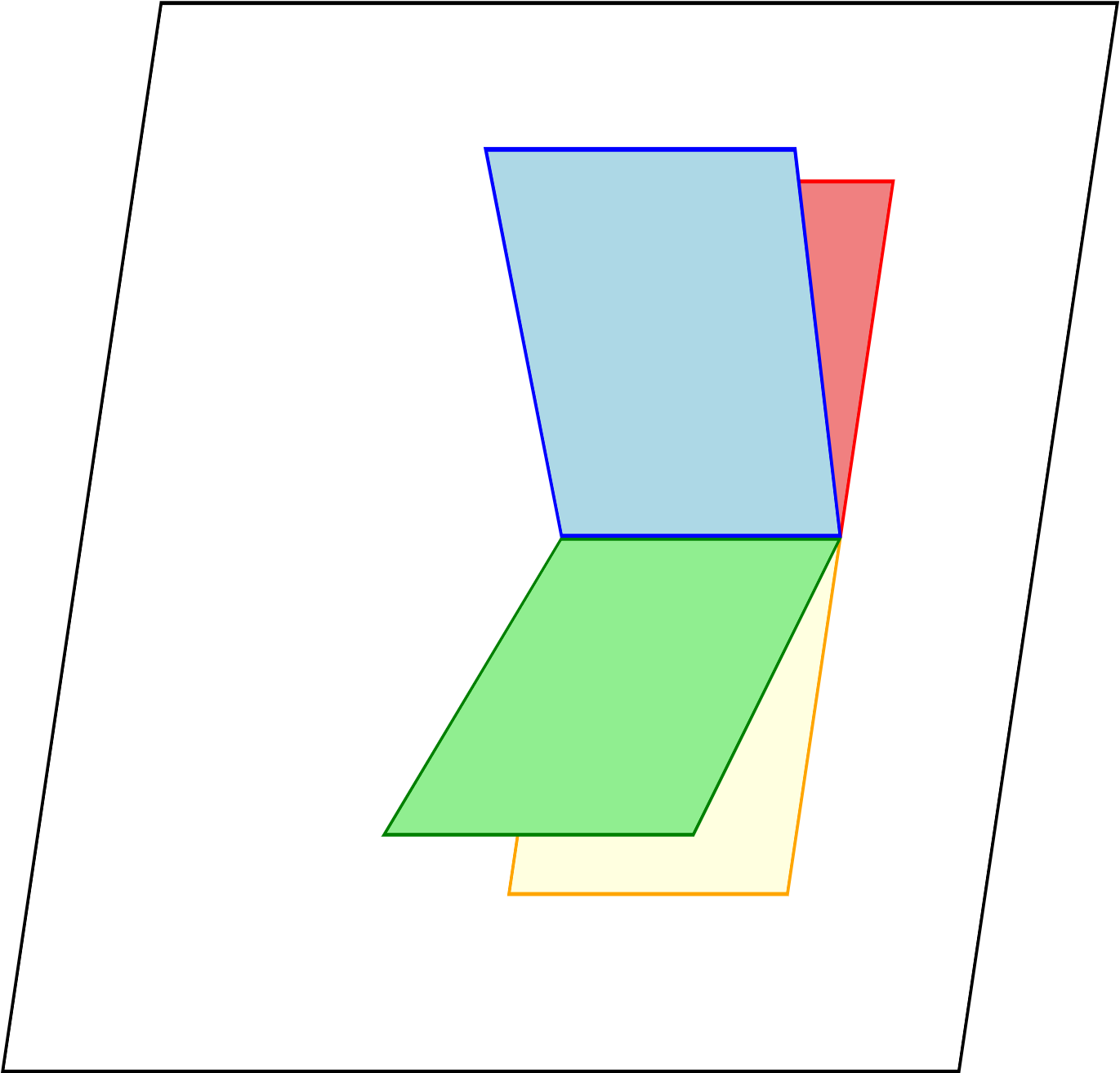
竖版改为无限循环,生成式最少需要4张纸:
文字描边动效
.introduce .left svg text[data-v-7449a9a0] {
    animation: stroke-7449a9a0 2.5s forwards alternate;
    font-size: 60px;
    font-weight: 700;
    font-family: QianTu;
}
0% {
    fill: #488a1400;
    stroke: var(--lcolor8);
    stroke-dashoffset: 25%;
    stroke-dasharray: 0 50%;
    stroke-width: 1;
}
70% {
    fill: #488a1400;
    stroke: var(--lcolor8);
    stroke-width: 3;
}
90%, 100% {
    fill: var(--gray);
    stroke: #365fa000;
    stroke-dashoffset: -25%;
    stroke-dasharray: 50% 0;
    stroke-width: 0;
}
fill / stroke / stroke-dasharray / stroke-dashoffset这些属性只对 SVG 图形元素(<path> <circle> <text>等)生效,对普通的 HTML 标签(比如<h1>)是无效的
<!DOCTYPE html>
<html lang="zh-CN">
<head>
  <meta charset="UTF-8" />
  <title>SVG 文字描边动效</title>
  <style>
    :root {
      --lcolor8: #4caf50;  /* 描边颜色 */
      --gray: #333333;     /* 填充文字颜色 */
    }

    body {
      margin: 0;
      height: 100vh;
      display: flex;
      align-items: center;
      justify-content: center;
      background: #f5f5f5;
    }

    svg {
      width: 600px;
      height: 150px;
    }

    .stroke-text {
      font-size: 60px;
      font-weight: 700;
      font-family: sans-serif;
      animation: stroke 2.5s forwards;
    }

    @keyframes stroke {
      0% {
        fill: #488a1400;         /* 透明填充(#RRGGBBAA,最后 00 透明) */
        stroke: var(--lcolor8);
        stroke-dashoffset: 25%;
        stroke-dasharray: 0 50%;
        stroke-width: 1;
      }

      70% {
        fill: #488a1400;         /* 仍然透明,只看描边 */
        stroke: var(--lcolor8);
        stroke-width: 3;
      }

      90%, 100% {
        fill: var(--gray);       /* 填充为灰色文字 */
        stroke: #365fa000;       /* 透明描边 */
        stroke-dashoffset: -25%;
        stroke-dasharray: 50% 0;
        stroke-width: 0;
      }
    }
  </style>
</head>
<body>
  <svg viewBox="0 0 600 150">
    <text
      x="50%"
      y="50%"
      text-anchor="middle"
      dominant-baseline="middle"
      class="stroke-text"
    >
      文字动效
    </text>
  </svg>
</body>
</html>
shew妙用
skew() 会把元素沿着 X 轴 或 Y 轴 方向倾斜,形成平行四边形的效果。
它不会改变元素本身的大小,只是“拉斜”它的形状。
✅ 语法
transform: skew(ax, ay);- ax:沿 X 轴倾斜的角度(正值向右倾斜,负值向左)。
- ay:沿 Y 轴倾斜的角度(正值向下倾斜,负值向上)。
👉 还可以单独使用:
transform: skewX(angle); /* 只在 X 方向倾斜 */
transform: skewY(angle); /* 只在 Y 方向倾斜 */.button {
display: inline-block;
padding: 10px 20px;
background: linear-gradient(45deg, #ff512f, #dd2476);
color: #fff;
transform: skewX(-20deg);
}
.button span {
display: inline-block;
transform: skewX(20deg); /* 抵消文字倾斜,让文字保持正常 */
}💡 小技巧
- 常用于:卡片、按钮、标题条 的酷炫斜切效果。
- 和
rotate()不同,skew()是“拉伸斜切”,而不是旋转。- 如果倾斜后文字看不清,可以在内部文字再加一次 反向 skew 来抵消。
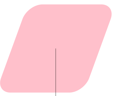
圆角平行四边形
.parallelogram-skew {
  width: 200px;
  height: 80px;
  transform: skew(-20deg);
  border-radius: 15px;
}
.parallelogram-skew span {
  transform: skewX(20deg); /* 抵消文字倾斜,让文字保持正常 */
}
使用伪元素(不影响文字倾斜)
.element::before {
    content: '';
    position: absolute;
    top: 0;
    left: 0;
    width: 100%;
    height: 100%;
    transform: skew(-20deg);
    border-radius: 10px;
    z-index: -1;
    background-color: pink;
}
.element {
    position: relative;
    display: inline-block;
    padding: 30px;
}
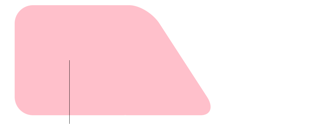
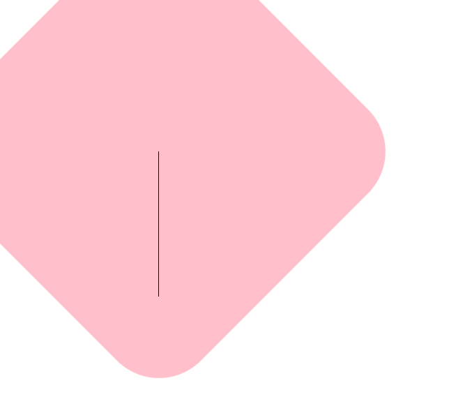
圆角梯形
平行四边形+原来的矩形=圆角梯形
矩形可以使用::after来
.element::before {
    content: '';
    position: absolute;
    top: 0;
    left: 0;
    width: 100%;
    height: 100%;
    border-radius: 10px;
    z-index: -1;
    background-color: pink;
    transform: translateX(32px) skew(33deg);
}
.element {
    position: relative;
    display: inline-block;
    background-color: pink;
    border-radius: 10px 10px 0 10px;
    padding: 30px;
}
效果:
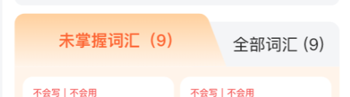
使用场景
棱形
skew(-32deg,32deg)甚至可以造就棱形
背景设置
1、固定定位的全屏背景
固定定位,锚定在视口上,大小等于视口。不管页面滚动到哪里,它都会 固定不动。
.inviteBackground-fixed {
    position: fixed;
    top: 0;
    left: 0;
    width: 100vw;
    height: 100vh;
    backgroun:"..."
    z-index: -1; /* 确保在其他内容后面 */
}
2、 绝对定位的背景
充当一个元素的背景,如果父元素没有设置相对定位,就会使顶层元素的背景
.inviteBackground-absolute {
    position: absolute;
    top: 0;
    left: 0;
    width: 100%;
    height: 100%;
    background:""
    z-index: -1;
}
3、页面级背景
元素本身是正常流布局(不脱离文档流)。
background-attachment: fixed → 背景图相对于视口固定,不随滚动移动。
效果:背景“贴在窗口上”,但内容可以在上面滚动。
移动端支持差(很多手机浏览器不支持)
.inviteBackground-page {
    width: 100%;
    min-height: 100vh;
    background-image: url('https://via.placeholder.com/1920x1080/FF5722/white?text=Background');
    background-attachment: fixed; /* 滚动时背景固定 */
}背景设置技巧(min-height)
<style>
    .container {
        position: relative;
        min-height: 100vh;
    }

    .backgroundTop {
        position: absolute;
        top: 0;
        height: 300px;
        width: 100%;
        z-index: -1;
        background-image:
            radial-gradient(circle at left top, #d0eef9 0, #eef0fa 250px, transparent 300px),
            radial-gradient(circle at right top, #e0e6ff 0, #f4f5f7 300px, transparent 200px),
            linear-gradient(to bottom, #f4f5f7 0);
    }

    .backgroundBase {
        position: absolute;
        top: 0;
        bottom: 0;
        width: 100%;
        background-color: #f4f5f7;
        z-index: -2;
    }
</style>
<div class="container">
    <!--这里可以设置安全区-->
    <div class="backgroundTop"></div>
    <div class="backgroundBase"></div>
</div>
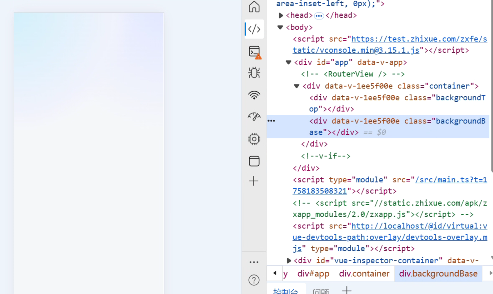
使用相对定位设置背景色,两层背景色随页面移动
基础背景色
backgroundBase始终大小与container一致,但是container内容高度不一定能占满整个屏幕,导致显示效果差。设置
container最小高度为全屏,在移动端展示效果极佳最终效果:
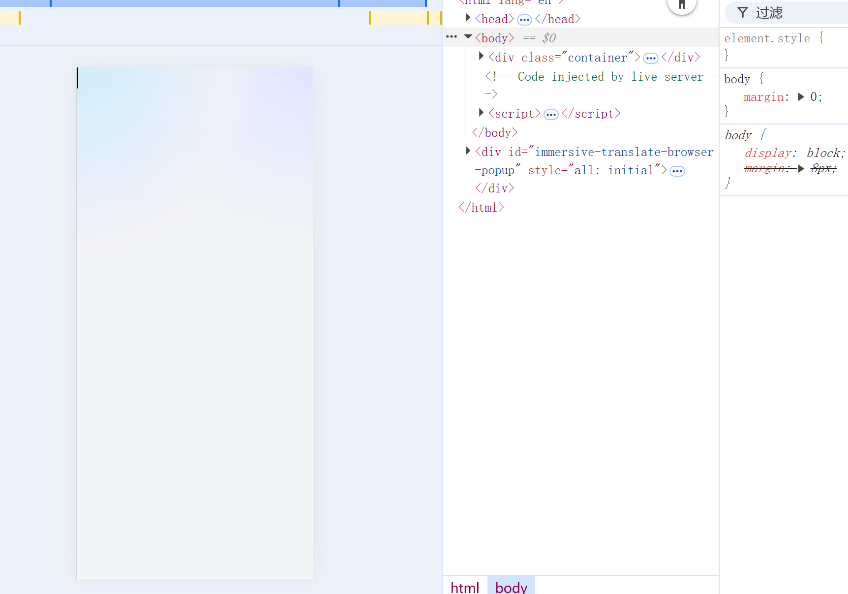
为啥不使放在一个背景里面呢?试一试
<style>
    .container {
        position: relative;
        min-height: 100vh;
    }

    .backgroundTop {
        position: absolute;
        top: 0;
        bottom: 0;
        width: 100%;
        z-index: -1;
        background-image:
            radial-gradient(circle at left top, #d0eef9 0, #eef0fa 250px, transparent 300px),
            radial-gradient(circle at right top, #e0e6ff 0, #f4f5f7 300px, transparent 200px);
        background-color: #f4f5f7;
    }
</style>
<div class="container">
    <!--这里可以设置安全区-->
    <div class="backgroundTop"></div>
</div>
一样的效果:
美化details
<!DOCTYPE html>
<html lang="zh-CN">
<head>
    <meta charset="UTF-8">
    <title>CSS interpolate-size 极简折叠动画</title>
    <style>
        /* 1. 核心:开启全局高度关键字插值 */
        :root {
            interpolate-size: allow-keywords;
        }
        summary {
            background-color: white;
            padding: 16px;
            border-radius: 14px 14px 14px 14px;
            transition: all .5s;
            cursor: pointer;
            font-size: 21px;
            height: 26px;
            line-height: 26px;
        }
        details {
            width: 100%;
            --custom-color: #ba3028;
            border: 1px solid #e3e8f7;
            border-radius: 14px;
            user-select: none;
            overflow: hidden;
            background-color: white;

            /* 对高度直接进行过渡 */
            transition:
                height 0.4s ease-in-out,
                border-color 0.3s,
                box-shadow 0.3s;
            /* 闭合时的固定高度(需匹配 summary 的高度) */
            height: 58px;
            &[open] {
                height: auto; /* 魔法发生在这里 */
                border-color: var(--custom-color);
                box-shadow: 0 10px 15px -3px rgba(0, 0, 0, 0.1);
            }
            &:hover {
                border-color: var(--custom-color);
            }
            &:is(:hover, [open]) > summary {
                background-color: var(--custom-color);
                color: white;
                border-radius: 14px 14px 0 0;
            }
        }
        .content {
            font-size: 17px;
            padding: 16px;
        }
    </style>
</head>
<body>
    <details>
        <summary>点击查看详情(精简版)</summary>
        <div class="content">
            <p><strong>当前的逻辑:</strong></p>
            <ul>
                <li><strong>高度:</strong> 由 <code>interpolate-size</code> 直接控制从 58px 到 auto 的过渡。</li>
                <li><strong>内容:</strong> 配合 <code>allow-discrete</code> 实现简单的淡入,不再需要复杂的起始帧快照。</li>
            </ul>
            <p>代码更干净,维护起来也更直观。</p>
        </div>
    </details>
</body>
</html>
评论
评论加载中……